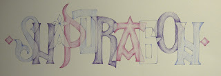
Life has been a bit busy since I returned from the CLAS Festival - now at last a chance to catch up and share some of the work done in my workshop. It was a daunting prospect my first experience of teaching at the Festival - though I have attended many myself. I was very pleased with how it all went - first of all the setting was amazing and the chance for a swim or a walk up the hill after class was a real bonus.
Day One
Drawn to Lettering - Line
We spent most of day one looking at pressure and release. We started with exercises inspired in this design book from the 1970's which describes a course for design students in Switzerland. It was on the shelf in the first school I taught Art in and I used it a lot in my teaching before I got interested in calligraphy.
We started just working with making lines on a sheet of A3 paper, using a sharp pencil, B or 2B increasing the pressure at the start and end of each stroke, leaving a space between strokes and working on creating a page of even texture.
This is the first example from the book
We gradually built up the exercises until we were nearly making letters, adding first diagonal strokes, then half horizontal and vertical strokes and then curves and small curves and joining two strokes together. The exercise is really good at making students look at the space around marks and the overall texture of a page of lettering.
The art students would have spent several days on this process - I didn't feel I could make my workshop participants spend more than the first half of the morning on it before we moved on to looking at this cursive majuscule script from the 1st Century.
We made some backgrounds for a potential concertina book using sumi ink on BFK Rives printmaking paper and these were some of the results at the end of one day using charcoal pencil and/or coloured pencil and some watercolour pencil.
Day Two Drawn to Lettering - Shape
We started day two with some warm up exercises practising and refining shading techniques. Then looking at shape and to try to get ourselves away from line we used paper and knives. There are 26 letters in the alphabet but only ten numbers so we used numbers and developed designs overlapping and repeating shapes using tracing paper.
I was thrilled with the resulting designs:
Moving on and using a favourite old book of mine that my father bought second hand for 7/6d (that's old money for 37p) called Alphabets Old and New edited by Lewis F Day with a preface to the third edition in my copy, written in 1910. This is the book that started my interest in lettering - it has drawings of letters from inscriptions and manuscripts that are put into alphabetical order - the pages we used for inspiration were from the Book of Kells and the Lindisfarne Gospels.

These were the results - all very individual.


