I am very pleased with the progress of my weekly class this term. Everyone, from beginners to more advanced, produced lovely books and it was a chance to use all those experimental practise pieces on the covers.
Wednesday, 18 December 2013
Tuesday, 26 November 2013
Students' work
I am very excited to see how my class are getting on with their uncial work - here is a taste of what is to come! Here they are hard at work in the re-arranged teaching room.
It may look a bit of a mess but we also had a look at my collection of calligraphic christmas cards.
All now facing the windows for better light, more concentration and less chat!!
pieces ready cut for covers
Wednesday, 20 November 2013
Teaching Uncials
We've been looking at uncials in my weekly class this term. I've been inspired by a picture I saw on Yukimi Annand's Facebook page where she had cut out 3 squares from each of three sheets of paper covered with very different writing and joined them to form a concertina.
I suggested to my class that they choose two or three sheets of coloured Canson pastel paper and do their writing practise in gouache in different colours that relate to the paper - some light on dark and some dark on light. They should not worry about any mistakes because we would select different sections from the sheet to use as the back cover of a simple concertina book. The inside of the book would be more carefully written with their own chosen texts.
Here is my demonstration version, mistakes and all! I have used paper that I had in my store and would ideally have liked a very dark brown paper instead of the pinkish grey.
The backing paper has been stuck onto the Fabriano Artistico HP 90lb used for the inside, with Jin Shofu paste bought online from Shepherds - I have to look up the proportions every time I use it but now know it is 1:5 powder to water. This was heated gently, stirring all the time until it thickened, in a saucepan on the hob (it can also be done in a microwave, but we don't have one in my teaching room). The paste needs to be left to cool and sometimes needs further thinning with cold water. I know you can make your own wheat starch paste but this works out quite economically because I only use about a teaspoonful at a time and it is very reliable. The book was left to dry between two place mats under a pile of books and kitchen weights.
The writing was executed with a 3 1/2 Mitchell nib and walnut ink (I should have left it to dry a bit longer before doing the backing because some of the letters smudged a bit)
Don't make the same mistake and trim the covers on the folded edges without being really careful!! I had to patch this with an extra piece of paper on the inside!
I used a variation of uncial making it taller than normal and narrower with a slight forward slope and some manipulation of the pen. My choice was inspired by flat pen uncials and one of the examples in Gaye Godfrey-Nicholls' new book 'Calligraphy, Tools & Techniques for the Contemporary Calligrapher' and the work of Vivien Lunnis.
The poem is Missing Days by my friend Sue Kindon
I look forward to posting the results of work done by the class soon!
Friday, 20 September 2013
Heraldic Arts
I am doing my heraldry backwards! By that I mean I have just started a CLAS Certificate of Skills course in Heraldic Arts, with the hugely talented Tim Noad. He and I are members of Oxford Scribes and we have 7 other members on the course and 4 other CLAS members joining us.
We started two weeks ago looking at how to draw a shield correctly and then how to do it in paint with a ruling pen. Try as I might there is always an inaccuracy in my drawing. I am working on the homework now. Here are the early examples:
and some I did earlier - I'll show the finished ones later...
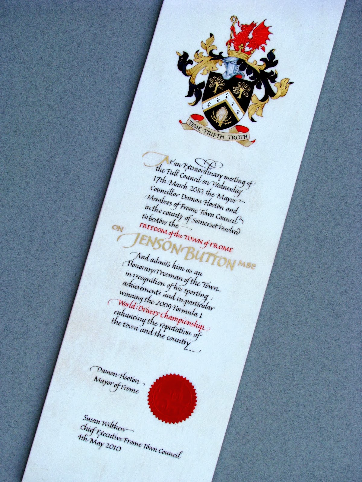
The backwards bit comes because I have just finished an Affiliation Scroll for the Worshipful Company of Leathersellers. It has been a very steep learning curve and I have had advice from Tim through the roughs stages and the final piece. I couldn't have done it without him. The nearest equivalent commission I have had was to do the Freedom Scroll for Jenson Button's Freedom of Frome which I completed while I was studying part-time at Reigate with Gerald Mynott:
This is Heather Child's version of the Leathersellers Arms
My first go at the arms drawn larger than finished size
Practise version number two - I have corrected the number of sections on the crest to six, changed the motto scroll to a much better shape and changed the colour of the lining of the helm and the scroll so there is not so much red. I used Winsor blue with a touch of zinc white. I had the roe deer looking at you because that is how it is on a tapestry at the Leathersellers and on their website but I was advised that I should not change it - there is so much to learn with heraldry about what you can and can't modify! I have stylized the mound after Tim showed me some had done.
My practise version of 1st the Queen's Dragoon Guards Badge:
The three roughs I produced - the bottom one was chosen
This is the second actual size practise version done on HP paper using gouache not real gold:
At last I was ready to start on the vellum. I had a lovely skin from Cowley's. The lady I dealt with
had been trained with the help of funding from the Leathersellers so I could trust her to select me an ideal skin and it saved me a very long drive to Newport Pagnell.
So after tracing everything out using Armeniam bole on a sheet of tracing paper, I started as traditionally done, with the lettering. It is a delight to write on vellum and it always seems to look better than the practise one - thank goodness!
Next job is the coloured lettering:
Then I did the gold lettering using Ormoline - it did not go well and all needed scraping back - the lettering just wasn't sharp enough. I took to Facebook and got advice from Canada, London and Australia!
Now it's time for the gesso - I used a batch I had used before with success:
Transfer and loose-leaf gold applied, shell gold for the flat areas e.g. the deer and the re-done lettering and then time to start the fun bit - painting...
Here is the finished result - only about 4 months work!
Thursday, 29 August 2013
Finished Work and New Beginnings
Phew! At last I have finished the biggest commission I have ever undertaken. I will reveal all when I have been paid. I seem to have spent most of this beautiful summer indoors working.
I have taught three special workshops for my class and others and it has been good to meet people again who have been on my mailing list for some time. It is a time consuming process planning a good workshop taking at least a whole day to prepare and often many materials to buy in order to sell enough for beginners to try something out. It does not always work out to be cost effective either and I have decided I need to be much more business like.
I have started by writing up some price plans for commissions so I do not have to make individual quotes for every email enquiry. I am seriously considering giving a discount to clients who make the effort to visit me - these commissions tend to be much more satisfying as I can get a real idea of what someone wants by talking to them and seeing their reaction to different pieces of work rather than by the stilted process of email where brevity can come across as rudeness.
I feel the need to educate clients more about the process of creating a piece of calligraphy - it really isn't the same as hand writing and it is the invisible process of trials, planning, ruling up and rubbing out that takes the time. The actual process of completing a piece is the most rewarding and sometimes the easiest bit. Don't forget the years and years of learning new hands, practising and developing skills too.
Tuesday, 28 May 2013
botanical illustration at Kew
Well this is the final tally after two weeks work - not a lot to show really! I am pretty sure I shall pursue this interest but maybe with a different teacher - I would like to see how some other people approach the subject.
This is the one I am most pleased with but I didn't get to finish it as the method we were taught was incredibly slow and didn't allow for watercolour washes to build up the background colour, working only in layers of tiny dots of very washed out watercolours.
Subscribe to:
Posts (Atom)