Pages

Sunday, 15 March 2015

CLAS Study Day at Winchester Cathedral

I just loved seeing the heraldry in Winchester Cathedral at the CLAS study day last September. Here are a few examples that I will refer to for inspiration in the future


a different way of doing mantling - different colours for husband and wife I assume


love the oak leaves in this design and the one below


This was helpful for the mitre design on my Lincoln college commission.


Oh dear I wish I had written down who worked on this beautiful memorial book! - could it be Grailly Hewitt?


Of course we were really here for the Bible and that was brilliant of course - we had an hour of private access to the exhibition and a really interesting talk from Jo Bartholomew curator of manuscripts, who told us that it had been commissioned by Henry du Blois (grandson of William the Conqueror), Bishop at Winchester and completed between 1150 and 1171 when Henry died. The Winchester Bible is very important in enabling us to know how these great works were produced because it was never finished and that allows us to see the order the work was done on each page. 

It is made up of 496 folios - that is more than 900 pages which would have needed skins from 250 calves to provide the vellum for its large pages.

One of the saddest facts, in my opinion, was to hear that a whole page, known as the Morgan Leaf was removed from the bible as late as 1820 and sold in 1912. It is now in the US.

Friday, 31 October 2014

little book commission and a birthday card


A design for a friends birthday card, looking at positive and negative space and shapes within a freely drawn border. The black areas are cut out of thick white paper and some beautiful black tissue paper with silver flecks in it, that I bought a few years ago in Paris, is stuck behind. Some quick touches in gold gouache on the top to finish.


This is the finished book that I produced for a paper wedding anniversary present. The ivy is stencilled with soft chalky pastels brushed through. I cut the stencils out of acetate using a plotter cutter. One for the outside shape and another for the darker centres. I had to master an aspect of Adobe Illustrator first to get the outline shape from the original photograph in Photoshop. Not sure I can remember now exactly how I did it!


The lettering is done with a sharp Wolfs Carbon pencil and the paper is BFK Rives which is very hard to make corrections on - so I think the final version is at least the third one I did!
The words are from the song 'Just a little person' from the film Synedoche New York (2008) which was played during the couple's wedding and suited an informal lettering style which dances a little. The ivy is a reminder of the decoration at the reception.


I made a little slip-case too - to keep it in.


Wednesday, 14 May 2014

finished now - fame beckons!


 The Write On Maypole

I'm hugely embarrassed but proud to be taking up six whole pages in the latest edition of The EDGE  (The Calligraphy and Lettering Arts Society magazine) with all the stages of my prolonged efforts to finish the Oxford City Arms in time to exhibit it with Oxford Scribes Write On exhibition at the Oxfordshire Museum in Woodstock, which celebrates 30 years of Oxford Scribes.


Should I mention that I think it is a shame the background was white? might have looked better on grey but I am not complaining really.


This is the last stage of the work which took at least three days using watercolour for the fritillaries then finally time to get the pen out again and warm up – then the motto and the names of the six Oxford University colleges I had chosen in the border.


I thought it was all over but by this time the vellum was pulling the board so tight it was warping. It seemed the paper on the back of the board was coming unstuck so I have carefully removed it. Then I could see that the vellum was coming unstuck on one side. I replaced the paper and left it to dry. Lastly I put it under a window mount before framing with non reflective glass. Expensive but worth every penny as it is practically invisible.


Saturday, 1 February 2014

Back again to the Oxford Arms

Inspired by the heraldic skills workshops with Tim Noad I am getting on with my piece to be exhibited with Oxford Scribes this year in our anniversary exhibition. It is the heraldic arms of Oxford City and I have included six shields of the better known colleges of Oxford University. The work is a personal project to put into practise some of the skills I have learnt at Reigate with Gerald Mynott and on the CLAS certificate of skills course with Tim. The writing, shown in an earlier post is a description of the arms and the blazon.


after doing all the lettering as shown in an earlier post I added the red lettering using a larger mitchell nib and red gouache

Next was all the gold - gesso with transfer gold and a top layer of loose leaf and the flat areas in shell gold. It was very difficult laying the gesso for the circles with a ruling pen attachment to my compass.


Now the fun part starting the painting - I practised first on an off cut of the vellum which I had used earlier to practise the gold on. Using scarlet lake I put in the red areas using Tim's wet in wet method and then the black with lamp black and a bit of zinc white.


 I had to touch up the lettering on the words Oxford City to make it look more opaque.


While I had the black paint on my brush I did the tiny shield for Magdalen college - I know it is pronounced 'Maudlin' now!


Next colour the blues using Winsor blue mixed with zinc white.
I have also started to paint in the features on the lion over the shell gold using Vandyke brown - I used watercolour first and then moved on to gouache which was more successful. I mixed a tiny drop of gum arabic in too to help it to stick to the gold. I have also used watercolour - Paynes grey for the helm and shades of brown on the motto ribbon.


The edges of the shield have been highlighted in permanent white - top and left side and grey on the right side. The wavy bands representing the river have also been highlighted top and shaded bottom but the shield itself is left the colour of the vellum.

I have added shading and highlight to the bull and the mantling too.

The ermine spots have been added in permanent white on the elephant but still need enlarging.

The green beaver is a shade of Winsor green mixed with zinc white but the grass on the mound is using Winsor blue and spectrum yellow. I have mixed a little white and yellow ochre to tone it down as the colours recede.


At least two full days work doing all the tiny shields and using a head visor - it makes my neck ache a bit but at least I can see the detail.

and another day to outline the arms using a mixture of ochre and perylene violet....


finishing after the sun has gone down - so this was taken in artificial light.


Saturday, 28 December 2013

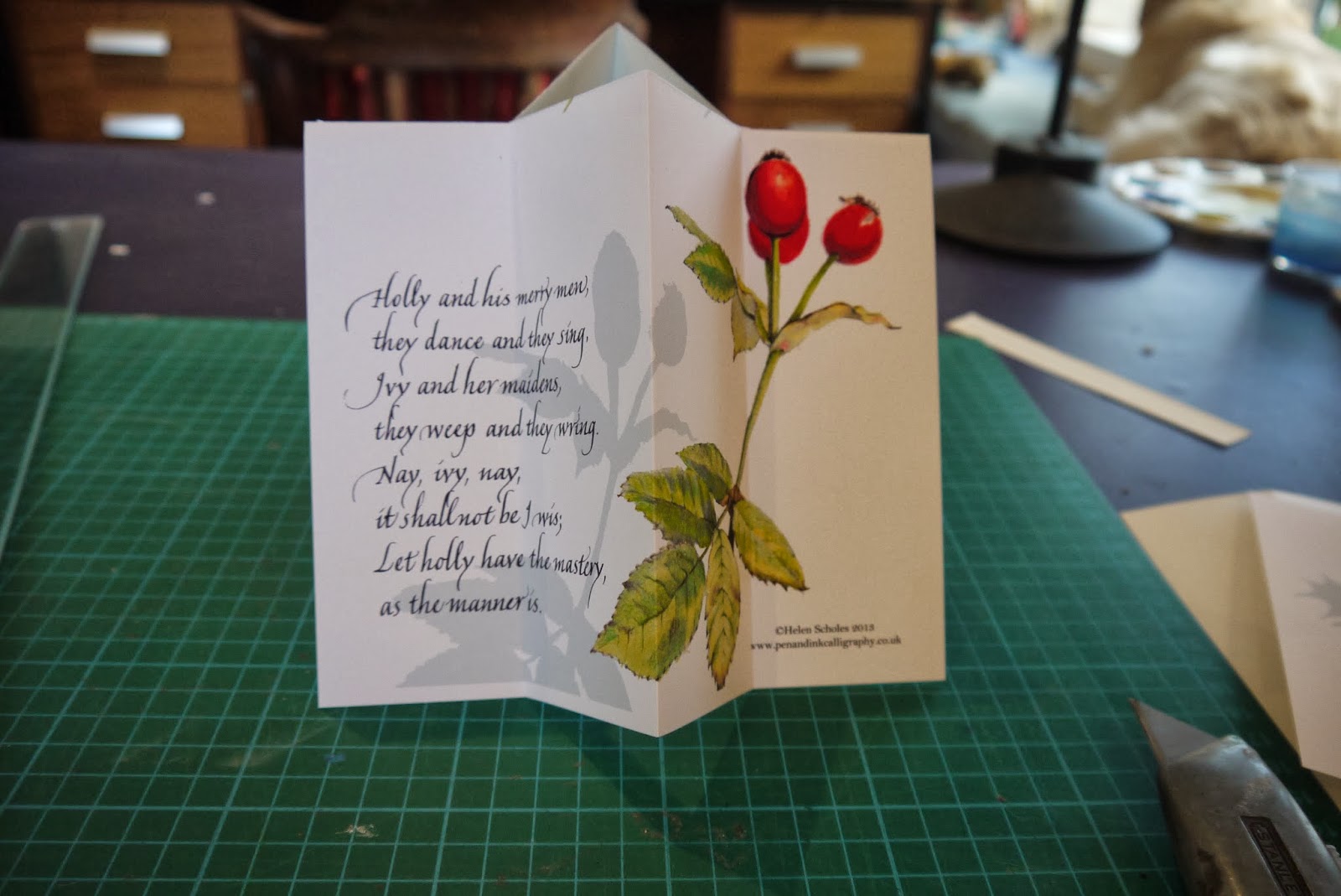
Botanical Christmas Card

This year's Christmas card was inspired by a visit to Ann Swan's open studio last month where I enrolled on a botanical illustration course using coloured pencils - so I thought I had better start practising! (www.annswan.co.uk)
Here are the two drawings I finished:


These images were scanned into Photoshop (had to buy a new scanner and printer to be able to get the detail and the colour to match - I spent some time researching Which? and other websites and bought an Epsom XP-800 all in one printer and an Epsom Perfection V730 Photo scanner - and I am very pleased with both). 

I used the magic eraser tool to remove the backgrounds, copied the images and used a colour overlay to create the shadow effect and added some scanned in lettering of a traditional version of the Christmas carol The Holly and the Ivy. This was also overlaid with a dark grey colour to make it look more solid. The design went through several permutations before I ended up with this version, although I had a fairly clear idea of what I wanted before I started. The addition of the shadow effect suddenly brought it all together.

The new printer is much faster than my old HP one and I printed these onto 170gsm matt photo paper  which really allowed the reds to glow. The printer can print much closer to the edges of the page so no need to trim each one - just fold, fold, fold, fold and cut.....


Wednesday, 18 December 2013

End of term and finished work

I am very pleased with the progress of my weekly class this term. Everyone, from beginners to more advanced, produced lovely books and it was a chance to use all those experimental practise pieces on the covers.