Pages

Tuesday, 19 February 2013

Poetry collaboration with Radley College

Last year Oxford Scribes were asked if they would like to take part in a joint exhibition with Radley College, a private boarding school for privileged boys near Oxford. They would write the words and we would produce calligraphy inspired by these poems.

An exhibition was planned for March 2013.

A group of calligraphers, including me, went to visit the school in September and were invited to lunch in the panelled dining room before demonstrating how we plan a piece of calligraphy to the five boys who turned up. I showed a Powerpoint of the collage piece that I started at Malvern - see post from October 2012 Mick Paine Workshop.

Finally in November the poems had been written and were distributed among Oxford Scribes - preferences were taken into account where possible and all poems were allocated to calligraphers with some people being asked to do 2 pieces.

Some of us have met together since then to share ideas and find starting points for the work. We looked at suitable colours, layouts and old copies of Letter Arts Review etc for inspiration.

This is my first poem in the form I first saw it:


I wish I could take language


I wish I could take language, and
Unroll it like a dusty carpet.

I would lay it out on the ground;
I would clean the regular patterns.

The smell of sappy wood and candle wax,
Or something older still.

I would keep its surface unblemished,
And keep away the dirt and filth.

I wish I could take language, and
Remove its signs of wear

Where new tears have been created,
Where colours have worn away.

I wish I could take language
And heal its wounds,

Wounds we have formed words for.

Joshua Dernie


This is my final piece for 'I wish I could take Language' - I was inspired by the colours of turkish kelims, suggested by the line 'unroll it like a dusty carpet' - and decided to use this lovely textured paper which I had in my store. I found it was impossible to use a pen without picking up the fibres, so I had to use a pointed brush. I kept the design fairly free, compensating for lack of space by overlapping and shortening words and using ampersands where necessary.

My second allocated poem was:


Mirror


I am a picture that can't not be,
bound and bordered in what you see.

I am you trapped in this place,
now and forever lost in a face.

I sit in your thoughts
and hide in my dreams.

I live in a lie
and it mutes my screams.

I question life
that is not what it seems.

And I have no answer
For I am not me.

Callum Godfrey

I chose this piece because I saw it as a book or using some kind of device to create a reflection and I had several initial ideas but I kept coming up against the same problem i.e. that the first two verses were so much longer than the rest and it looked top heavy. The capital M is much wider than the other letters of the title too which did not help. I had had in mind the effect of broken glass and reflections but after several attempts and the equivalent of about three full days working on it, was still not happy with the background.


Version two and still the problem of the long verses at the top even though I had broken the lines in two. It was better in capitals than italic (done in charcoal pencil here) but it just wasn't working - so I went back to the computer and tried some quick layouts in Word with the two first verses next to each other and then the whole poem started to make sense as statement and response.


So this is my final version using W&N silver gouache with a little white in it and a dark red reminiscent of the back of an old mirror with the opposite colour used to pick out the dots between the words, a device used in old manuscripts. The hand used is based on the cursive roman I have worked with before with a few personal adaptations e.g. the curly G inspired by the David Jones workshop before Christmas. This final piece probably took 6 hours to letter also with a pointed brush with each letter built up of several strokes - it was starting to flow more easily by the end of the page!


Monday, 31 December 2012

David Jones at Ditchling

I was recently privileged to attend a workshop on David Jones taught by Ewan Clayton. It took place in the cottage where David Jones lived in 1922, just outside the village of Ditchling in Sussex.


This village is famous among calligraphers for being the home of Edward Johnston and is also where Eric Gill had his workshop and where David Jones worked for a short time.


David Jones was not here long but he left his mark by painting a mural on the kitchen wall - which I can't show you because it is in copyright. At first glance I thought it was particularly appropriate for the time of year because it shows a figure in blue with a halo, riding on a donkey but on closer inspection I think the crowd around the figure and two donkeys are holding palm leaves so I assume it is a depiction of  Jesus and the ride to Jerusalem we celebrate on Palm Sunday.


It was a lovely venue for a weekend of study and Ewan, who also grew up in Ditchling, had lots of background information and objects for us to look at. He explained that Jones was influenced by the deeply cut Roman inscriptions in the British Museum, but the work of the ordinary man rather than the perfection of inscriptions like that of Trajan's column.

 
maybe like this one found here from the British Museum
http://www.flickr.com/photos/typeoff/2224131638/


Inscription of an officer of III Cyrenaica, found near the Mausoleum of Caecilia Metella.
http://rambambashi.wordpress.com/category/latin-literature/


This image is from Typefoundry blog about Eric Gill - there is something very familiar in the curled G from and inscription carved by Eric Gill in 1907 - see more by following this link:
http://typefoundry.blogspot.co.uk/2009_12_01_archive.html


After looking carefully at some of the unusual letter forms in David Jones inscriptions and copying individual letters we were able to compare some e.g the n above, with objects in the cottage:


I chose to work on a quote from David Jones himself describing how he worked. I tried to use similar colours and worked on hot pressed paper that I covered with white stick ink to emulate the effect that Jones tried to get of white washed walls into the background. I think my letterforms are a little lighter than Jones's though.


I repeated the exercise when I got home, though there is still a bit of touching up to do around the P and R in 'carefree'. I liked being able to work in this way, using a pointed brush and building up the letters and sometimes cleaning out areas and overpainting them in white. This is how I started lettering when doing graphic design at art college and before I started to learn about calligraphy.


 Nicolette Grey wrote the definitive book on David Jones called 'Painted Inscriptions of David Jones' she is one of the calligraphers I find most inspiring, particularly a slim volume called Lettering as Drawing which has also been influential in Thomas Ingmires work.

If you follow this link you will find more information about Nicolette Gray and her friendship with David Jones and this full colour image of one of his inscriptions on the Tate website. (As we are invited to share the image via Facebook etc on the Tate page I think it will be ok to include it here)

David Jones, ‘Exiit Edictum’ 1949
http://www.tate.org.uk/art/artworks/jones-exiit-edictum-t03192/text-display-caption

Wednesday, 26 December 2012

Christmas cards again!

Doesn't Christmas come around quickly?
This year I was clear about what I wanted to do for a card and that was to use one of the photographs I took in Finland last year - I just needed some words to go with it.


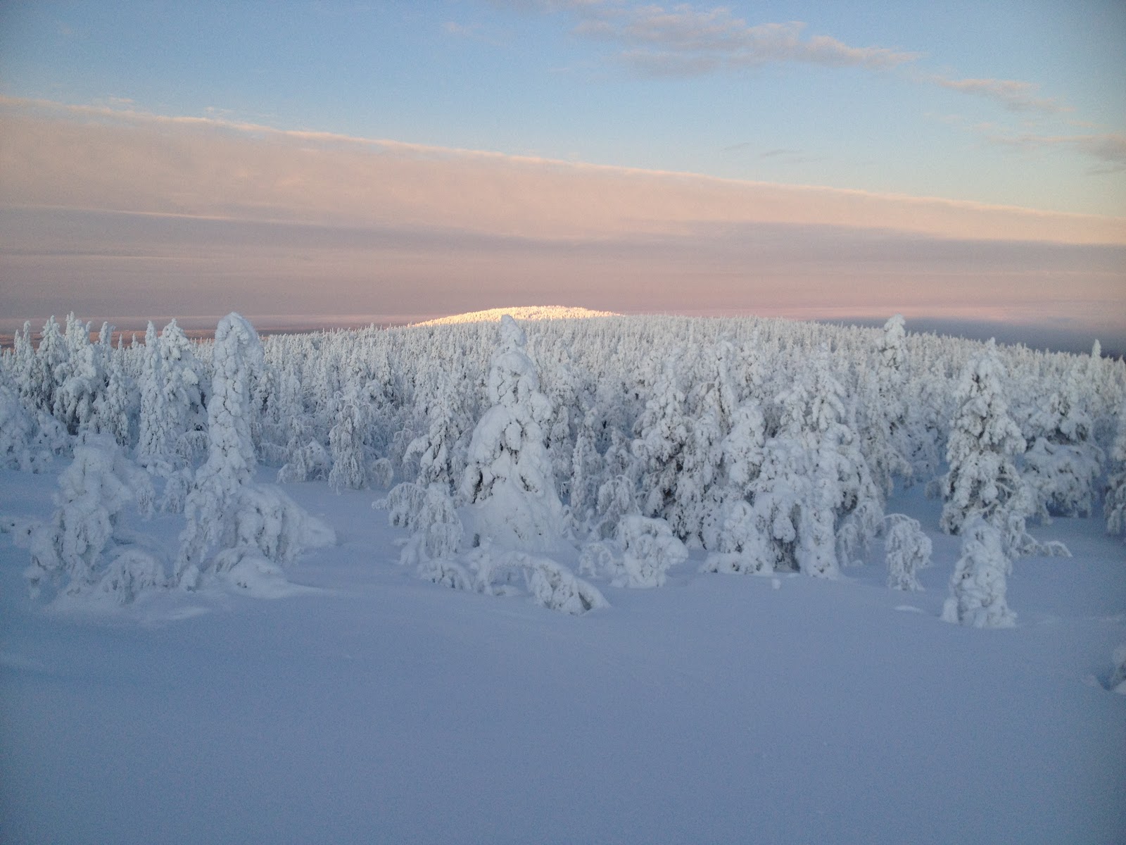
This is the photo I used in the end, it just needed a bit of cropping. It was taken the day the sun first appeared over the horizon after the winter in mid January 2013 near Luosto Finland. We didn't see the sun but we did see it shining on the top of the hill opposite!


I had thought about using this picturesque cabin situated next to the amethyst mine but it was a very dull day that we were there.


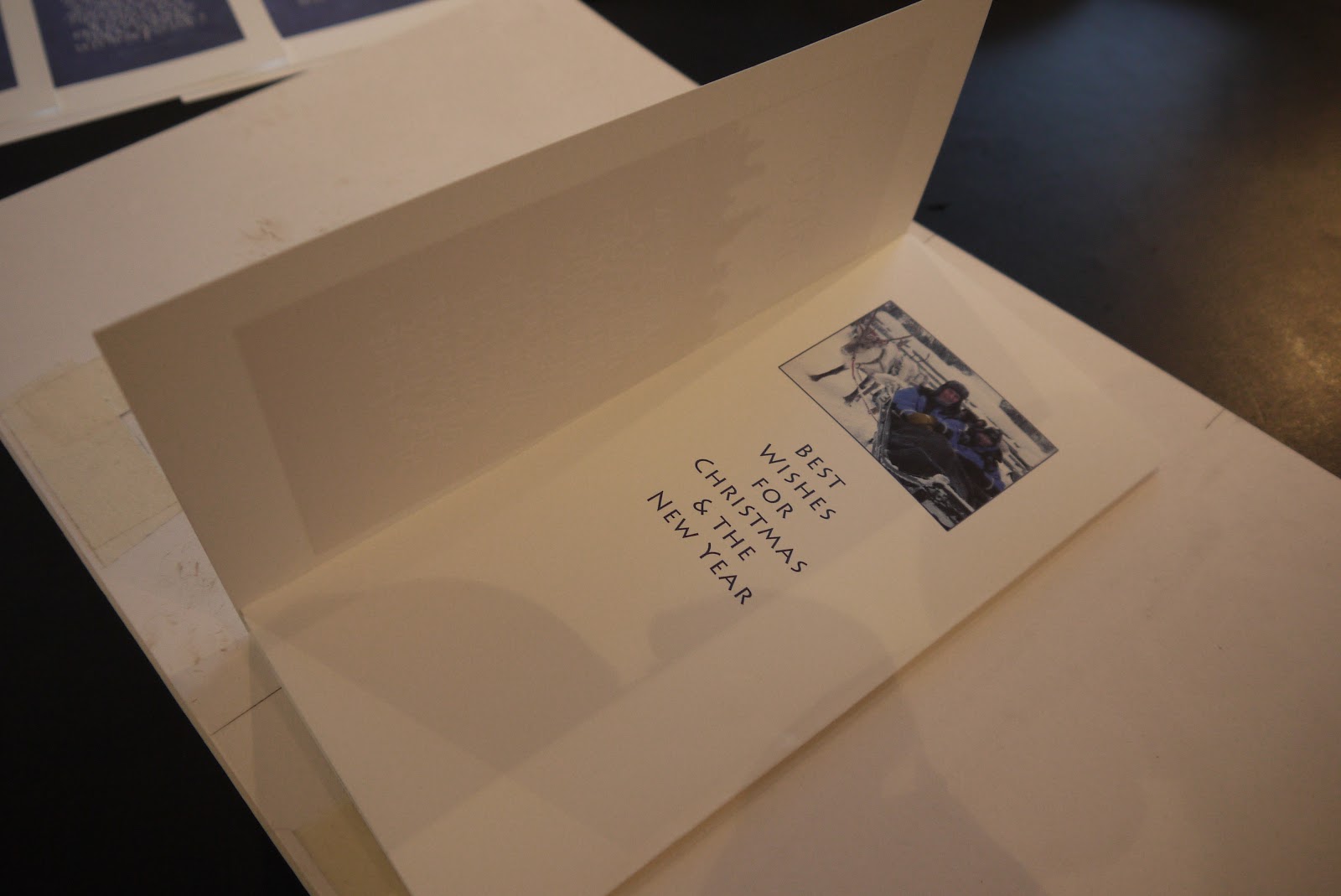
I couldn't resist using this picture of us in the reindeer sleigh but it is only inside the card.


The production line - adding the red pearl dots...


I found the quote by JB Priestley online, wrote it with a pointed pen and scanned it into photoshop where it was cleaned up and moved about a bit, curves adjusted then overlaid with white to show up on the snow background. Then came the fiddly bit of getting it to print the right size so it would fit squarely in the right hand third of the thin ivory card I was using to print it on.


folding in the right place using masking tape corners and pencil mark - fold one...


fold two...


the finished card!

Wednesday, 21 November 2012

Botanical Painting

I rather wish in another life I had studied botanical illustration - I guess it's not too late and I may yet find a way. The first time I used plant illustration with calligraphy was in 1999 for my CLAS Intermediate Diploma. 


This is the original piece photographed through the glass frame and I have a nasty feeling it has faded a bit - so a lesson in being very careful with pink paints.


A detail of the hellebore, done from life, using watercolour paints and now 13 years old (where does the time go?)


and here it is as I used it on my first website which is why it has the 'watermark' through it - now I may have worked on it a bit in Photoshop - the leaves are still a very similar colour but the petals were much brighter then.


This is the illustration from a commission I finished last night ....may just adjust the leaf furthest right - it looks a bit too blue....I started working on this from life but had to rely on photographs, which I had on the iPad and was able to stand up next to my work, to finish it. 

Saturday, 27 October 2012

Italic

 I have been teaching italic to both my classes this term and practising my own italic. I was given the most beautiful book recently 'Masters of the Italic Letter' by Kathryn A Atkins which contains this beautiful example of writing by Tagliente from 1491 complete with ink blot! This is the hand that I was referring to when trying to refine my italic for my Oxford coat of arms (still not finished!)


and this example from a writing book from Siena in 1545 by Bennardino Cataneo.


I had just downloaded the font Cataneo Lt BT to use instead of Monotype Corsiva when planning layout for commissions to be done in formal italic - to shorten the time taken by using a point size and expanding the font to match my own writing with various pens, particularly useful when writing long lists of names on invitations or place cards.


This lovely book shows examples of the same letter written by 22 different writing masters from the Sixteenth Century.


Ampersands ...


and more ...ampersands...


Thursday, 25 October 2012

Mick Paine Workshop

I was lucky to only be teaching for the first half of the Festival at Malvern, so I was free to attend Mick Paine's workshop in the second half. I have admired Mick's work since sitting behind him at the Sunderland Symposium - can it really be as long ago as 2003! It was the year the classes stayed put and the tutors moved round and Brody Neuenschwander was one of the tutors who demonstrated his collage method one day which he has used in this piece from the period that I like best of his work. See more here - www.brodyneuenschwander.com/gallery.php


Mick picked this up and ran with it. He gave a wonderful talk on his work last year at Letter Exchange too, so I was really looking forward to his workshop at last and really seeing how he worked. Mick used to have a very informative website but it doesn't seem to be up at the moment so here is just one example of his work.


 Mick's workshop was entitled 'Rules and Randomness' and started us off on a different way of approaching a new piece of work. It worked for me this time and got me off to a quick start. We began by writing down things that were important to us as individuals. Mine were - family; landscape; holidays we've had and two special books that I use frequently.


Procrastination averted, I started a mindmap with a family name of Field linking to the landscape idea and plans for a family tree which had been on hold for some time.


then using a dice and random number generator on my phone I selected from various lists and pages from the two books ...


p78 from Calligraphy A Book of Contemporary Inspiration by Denise Lach - the most inspiring book I have bought in recent years...


and page 186 from Alphabets Old and New (see previous post) - perhaps one of the least interesting pages in this book - but titled 'Cursive writing'


The country I had visited came out as Spain and as I was planning a visit to Barcelona at the time I took Antoni Gaudi as inspiration and used this photo of the walls at Parc Guell (I now know must have been taken when no-one was there) found online


I spent a lot of time colouring the middle section with pencil around the word family - I got pretty attached to it trying to link it to the crazy paving of the Gaudi wall - but it was not working and had to go! 


Things started to come together once that had been covered up with some paper I had coloured for my Salisbury Hospital commission last year (see piece below) when I first started to experiment with collage. 

I hope you can see the Denise Lach influence with the linked squares now covered with tissue with square holes cut in it and the reddish brown squares cut from one of my trials for my Kings and Queens piece (shown in the All That Glisters Exhibition and in an earlier post). 

Names from different generations filled the levels of the wall with grandparents at the top and children at the bottom.


Now some copper leaf added - but not happy with the word Genealogy...


so that got covered up with gesso and stencilled squares and lastly more significant names running vertically. 

I really enjoyed working on this piece and finished it back home over several days to allow for drying between stages. I like being able to cover mistakes and change the design as I go but I ditched the randomness once I got started because personally I think there comes a time when real decisions have to be made on aesthetic qualities and not just chance.


Here is my earlier collage of hand coloured papers with pointed brush lettering, gold leaf and coloured pencil, on one of three pieces completed for Salisbury Hospital. The words used were written by poet in residence Rose Flint.

Friday, 28 September 2012

CLAS Festival at Malvern

Life has been a bit busy since I returned from the CLAS Festival - now at last a chance to catch up and share some of the work done in my workshop. It was a daunting prospect my first experience of teaching at the Festival - though I have attended many myself. I was very pleased with how it all went - first of all the setting was amazing and the chance for a swim or a walk up the hill after class was a real bonus.


Day One
Drawn to Lettering - Line


We spent most of day one looking at pressure and release. We started with exercises inspired in this design book from the 1970's which describes a course for design students in Switzerland. It was on the shelf in the first school I taught Art in and I used it a lot in my teaching before I got interested in calligraphy.

We started just working with making lines on a sheet of A3 paper, using a sharp pencil, B or 2B increasing the pressure at the start and end of each stroke, leaving a space between strokes and working on creating a page of even texture.


This is the first example from the book
We gradually built up the exercises until we were nearly making letters, adding first diagonal strokes, then half horizontal and vertical strokes and then curves and small curves and joining two strokes together. The exercise is really good at making students look at the space around marks and the overall texture of a page of lettering. 


The art students would have spent several days on this process - I didn't feel I could make my workshop participants spend more than the first half of the morning on it before we moved on to looking at this cursive majuscule script from the 1st Century.


We made some backgrounds for a potential concertina book using sumi ink on BFK Rives printmaking paper and these were some of the results at the end of one day using charcoal pencil and/or coloured pencil and some watercolour pencil.


Day Two Drawn to Lettering - Shape

We started day two with some warm up exercises practising and refining shading techniques. Then looking at shape and to try to get ourselves away from line we used paper and knives. There are 26 letters in the alphabet but only ten numbers so we used numbers and developed designs overlapping and repeating shapes using tracing paper.


I was thrilled with the resulting designs:


Moving on and using a favourite old book of mine that my father bought second hand for 7/6d (that's old money for 37p) called Alphabets Old and New edited by Lewis F Day with a preface to the third edition in my copy, written in 1910. This is the book that started my interest in lettering - it has drawings of letters from inscriptions and manuscripts that are put into alphabetical order - the pages we used for inspiration were from the Book of Kells and the Lindisfarne Gospels.


These were the results - all very individual.