Finally got to the end of a load of invitations to add names to - some very famous names included - but frustrating in that the space for some very long names, mostly couples, was rather narrow. People don't realised that calligraphy is not like computer fonts - you can't write at 8pt size - or at least I can't!
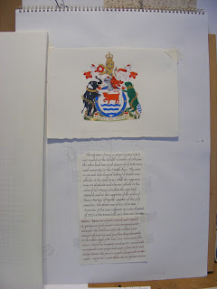
So a bit of time to go back to the heraldry, last looked at before Easter. This is just a piece to show what I think I can do! I chose to rework the Oxford City Arms as being a member of Oxford Scribes it seemed relevant and looked an interesting achievement of arms - have to admit to going off it a bit now, green beavers and black elephants with fleur-de-lis are not easy to draw, not to mention the gold chain! This is an early rough.
I have used the same bit of tracing paper to copy a reduced version of the original artwork (9o%) and the outline of the decorative border. This is going to have more gold chains, fritillary flowers - common around Oxfordshire and some of the University shields.
Persevering with the quill - or rather three different quills I wrote out a practise piece which has been ruled up on Arches paper...
and then felt ready to tackle the stretched vellum...
but made the common calligraphers mistake of leaving a whole line out 5 rows before the end of the description of the arms. So I had to take out the last five lines.....
and then decided that the lettering wasn't nearly sharp enough and I might as well take the whole lot out.....
still rubbing.....


No comments:
Post a Comment