Pages

Sunday 22 March 2015

Sword of Honour

Project number two was to redesign the document that went with the Sword of Honour presented to Radley College near Oxford after the Second World War. I have also seen an identical case at Marlborough College. The new document for Radley was to be framed to go with a new glass case for the sword itself in the magnificent new school art gallery.


The work was to be on stretched vellum and took many hours working on the design of the arms. A lot of research is necessary and I have started to keep reference photographs on Pinterest. I have created boards of heraldic reference and I prop up the iPad on my desk to refer to when drawing out,  refining and improving the design. 

Finally I started work on the real thing. As usual it is traced through an Armenian bole sheet to give a red outline. The lettering is done first, then the gold, then the painting.


All the ruling is still visible and changes to refine the motto scroll...


Creating the metallic effect of the helm, armour and helmets is the most tricky area. This was done using watercolour rather than gouache paint. The final bit is always writing the motto on the scroll. I repeated the red rose from the compartment (that is the grassy mound under the shield) as a break between text areas on the final document.


Sunday 15 March 2015

Lincoln College Benefactors book


This was the first of three heraldic projects completed in Autumn 2014 which I worked on simultaneously, trying to work the colours and gold in parallel on each piece. This was for a book and had to finished, on the same paper, before the book was bound. This led to several problems to find solutions to....

Firstly the paper was fairly thin, as it needs to be for a book, but not heavy enough to avoid cockling when using wet media such as gouache - as you can see in the photo below of the first practice design where the paper is bruised.


I wasn't sure whether it was heraldically correct to use the above shape - I wanted to make the central panel wider at the bottom to line up with the division between the curves along the bottom edge of the shield. 

In the end I opted for a more straightforward heater shaped shield.


To avoid the cockling of the paper I stretched a larger sheet, making sure the grain was going the correct way i.e. parallel with the spine. But after working on it, I found on removing it from the wooden board it was stretched on, that the back was stained by the wood. This wouldn't normally matter on work that is framed but in a book it would show.

I sought advice from around the world via Facebook and decided to pack out the stretched paper with extra sheets to stop the stain coming through. This proved successful in the end and I was very grateful to the binder for sending me yet more blank sheets of paper!


Finally it was time to start work on the actual design...Firstly the lettering, protected with a piece of layout paper, then shell gold applied (above) before burnishing


then the colours....


and lastly modelling and burnishing and outlining - sounds quick when you say it but those lions took ages and the harts had to be 'dansant'...


a quick breather before starting again

I have been away from this blog for too long but for good reason and that is lots of work. I have just finished three heraldry projects and they take many hours of work each as the detailed progress shown in this blog of the working processes for my Oxford City Arms. I am writing one up to go in the magazine Bound and Lettered, an invitation that came about from a reader of this!

Together with the lovely Andi (below) we are planning next year's and the following year's Festivals for CLAS (The Calligraphy and Lettering Arts Society) We both attended as delegates this year to Malvern, which is also where our first festival will be. The programme is planned, nearly all the places are gone and now we need to visit some potential venues for 2016 and decide who we want to ask as tutors. It is amazing we find any time at all for our own calligraphy!


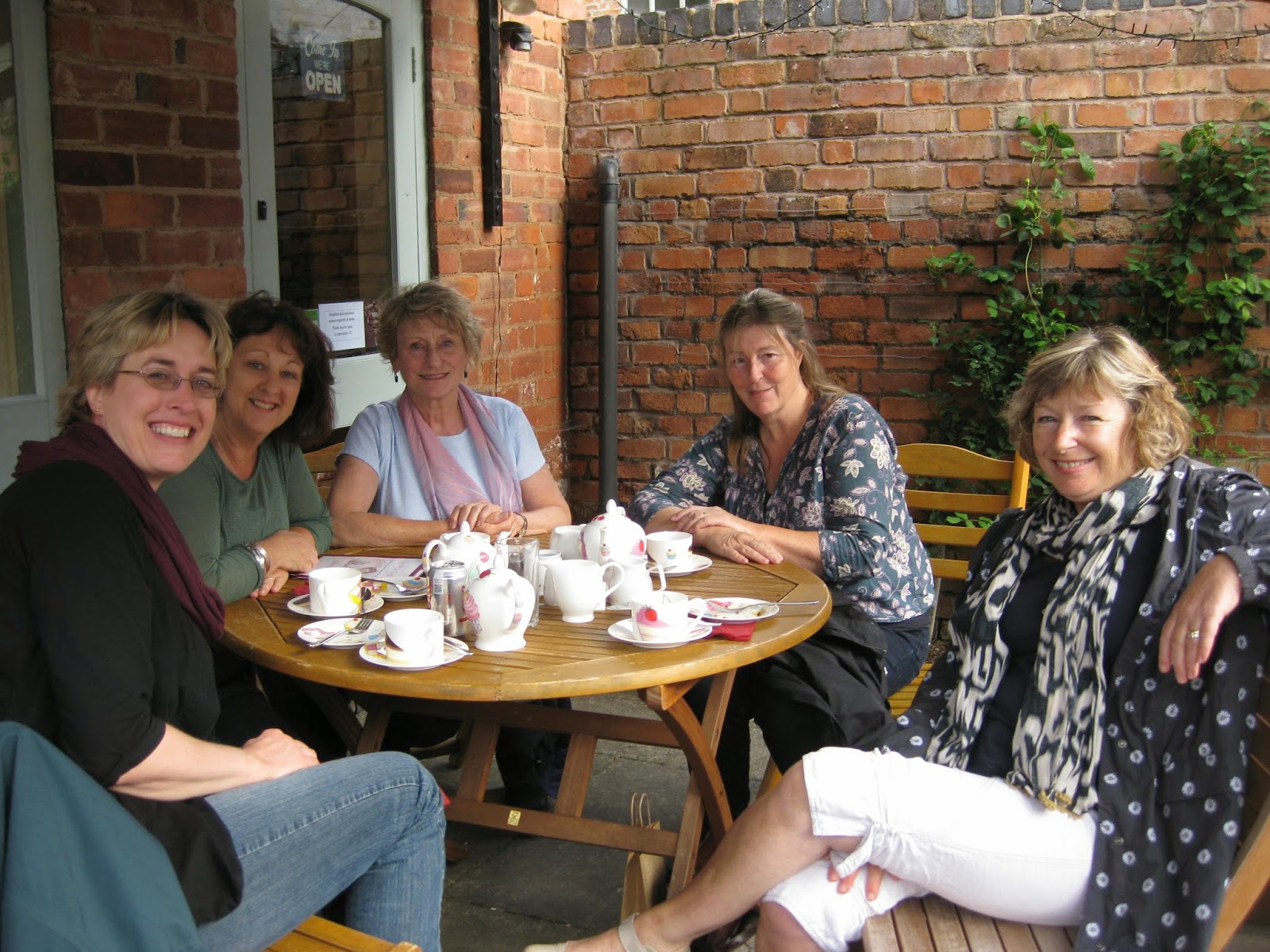
Here we are with friends, having a break in Ledbury on our free Monday afternoon.


Here we all are in Massimo Poello's class studying 'the dance of the calligraphic line' and 'Order and Chaos'


this is my book from 'Order and Chaos'

I found time to sort out my studio and invested in some new cupboards and shelves - much more appropriate and professional looking now.


Cleo needed to check out the shelving - it seems secure...


CLAS Study Day at Winchester Cathedral

I just loved seeing the heraldry in Winchester Cathedral at the CLAS study day last September. Here are a few examples that I will refer to for inspiration in the future


a different way of doing mantling - different colours for husband and wife I assume


love the oak leaves in this design and the one below


This was helpful for the mitre design on my Lincoln college commission.


Oh dear I wish I had written down who worked on this beautiful memorial book! - could it be Grailly Hewitt?


Of course we were really here for the Bible and that was brilliant of course - we had an hour of private access to the exhibition and a really interesting talk from Jo Bartholomew curator of manuscripts, who told us that it had been commissioned by Henry du Blois (grandson of William the Conqueror), Bishop at Winchester and completed between 1150 and 1171 when Henry died. The Winchester Bible is very important in enabling us to know how these great works were produced because it was never finished and that allows us to see the order the work was done on each page. 

It is made up of 496 folios - that is more than 900 pages which would have needed skins from 250 calves to provide the vellum for its large pages.

One of the saddest facts, in my opinion, was to hear that a whole page, known as the Morgan Leaf was removed from the bible as late as 1820 and sold in 1912. It is now in the US.